Brand Identity
GROUNDED
PEST CONTROL
Built on trust.
Rooted in purpose.
A pest control company built to protect what matters — homes, families, businesses, and the people behind them.
The Brief
A pest brand that
feels human.
Most pest control brands lean clinical, corporate, or fear-based. Grounded was built differently.
The goal wasn't to create another loud service company — it was to build a brand that felt steady, trustworthy, and deeply rooted in the people behind it.
Grounded blends rugged professionalism with genuine human connection. The identity pulls from western heritage, Arizona landscapes, and blue-collar grit — without slipping into cliché. Every element was designed to feel approachable, elevated, and built to last.
This is a company that shows up polished, dependable, and grounded in service.
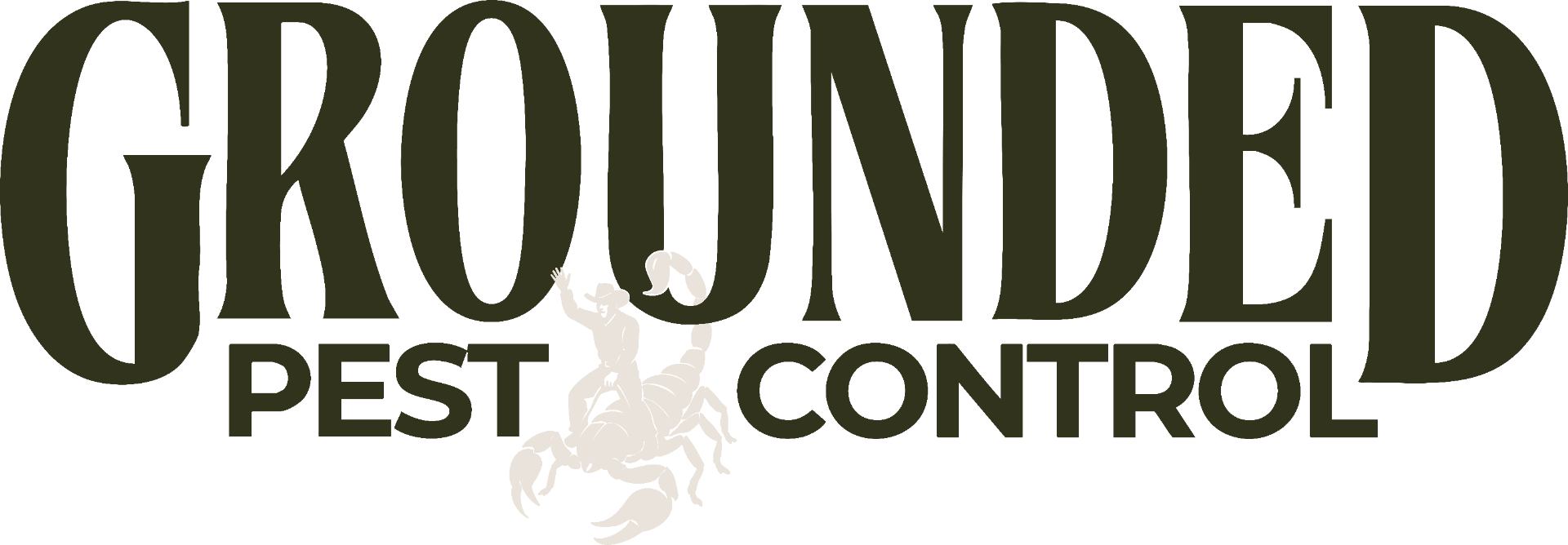
The Mark
A symbol of
resilience.
At the center of the identity is the cowboy riding the scorpion — a visual built from the founders' story.
The scorpion represents the hard things: adversity, chaos, the unexpected. The cowboy represents resilience. Steady hands. Staying grounded even when life tries to throw you off course.
It's a mark that reflects grit without aggression — strong, memorable, and deeply personal to the brand.
- · Hand-illustrated emblem rooted in story
- · Flexible logo suite for print, apparel, vehicles, and digital
- · At home on a truck door or a high-end proposal
- · Built to scale across residential and commercial
The Palette
Desert-inspired.
Dirt honest.
The color palette pulls directly from the Arizona landscape — sun-faded canvas, desert sage, dusk skies, worn leather, and grounded earth tones.
Instead of leaning clinical or overly corporate, the colors create warmth, trust, and familiarity while still feeling elevated and professional.
Every color reinforces the brand's core feeling: calm confidence.
Cream
#E9E2DA
Backdrop · paper
Tan
#D5C9B4
Warm canvas · trim
Sage
#929E9E
Quiet contrast
Olive
#898366
Field · workwear
Blue
#465763
Dusk · trust
Forest
#32331D
Ground · authority
The Type System
Strong where it matters.
Human where it counts.
The typography system balances structure and personality — bold enough to feel dependable, refined enough to feel premium.
01 · Display
League Spartan
700 · Bold
STAND YOUR GROUND.
02 · Accent
Halaney
Script · Signature
the desert way
03 · Subhead
Libre Franklin
500 · Medium
Service you can rely on, season after season.
04 · Body
Raleway
400 · Regular
Family-owned, relationship-driven, and committed to doing things the right way.
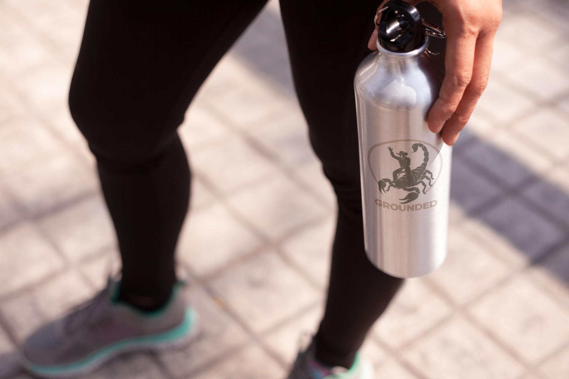
The Suite
One identity.
Built for the real world.
The Grounded logo system was designed for flexibility without losing recognition.
From truck wraps and uniforms to invoices, social media, signage, and commercial proposals — every variation works together as one cohesive brand experience.
Clean. Recognizable. Built to last.
 01 · Hero BadgeCream / Forest02 · Combo
 03 · Glyph
 04 · Primary Lockup
%20--%3e%3cdefs%3e%3cstyle%3e%20.st0%20{%20fill:%20%2332331d;%20}%20%3c/style%3e%3c/defs%3e%3cpath%20class='st0'%20d='M4487.98,945.77c4.35,1.33,6.52,9.01,6.13,13.52.33,683.25-2.96,1367.22,3.9,2049.93.62,61.48,5.53,140.97.04,200.33-.9,9.71-1.1,19.01-10.48,24.89-14.08,8.83-97.9,4.24-118.07.26-24.29-4.79-27.83-66.22-29.76-88.09-50.43-570.17-168.31-1240.93-484.77-1730.15-128.24-198.25-318.57-333.99-568.14-293.37-320.33,52.14-473.85,479.51-550.48,747.82-214.22,749.97-213.36,1572.99-203.58,2349.57,6.17,490.4,6.06,979.68,70.97,1466.15,45.71,342.61,150.93,887.85,447.13,1105.04,170,124.65,511.77,197.38,592.66-62.69,7.1-844.72,6.69-1690.97.19-2535.75-17.53-96.34-48.32-193.05-110.8-270.37-31-38.36-71.88-67.8-104.86-103.8-10.04-10.96-15.86-22.92,3.95-23.89l1293.4,3.95c43.95,13.05,118.5-5.8,98.88,63.06-20.39,71.59-72.97,150.51-91.35,226.94-12.33,51.3-8.4,103.66-10.04,154.63-23.01,715.14,5.23,1439.94.55,2156.4-.44,66.74,4.11,147.73,0,211.66-2.87,44.71-8.93,49.06-39.68,78.26-347.36,329.97-872.99,539.74-1354.23,526.98-576.34-15.28-1094.97-245.99-1435.22-713.56-532.24-731.4-645.21-1774.92-619.36-2655.38,25.44-866.23,265.32-1962.74,937.27-2567.26,432.2-388.84,1050.12-510.65,1605.5-333.12,165.67,52.96,372.1,182.91,533.48,66.3,14.69-10.62,68.46-68.26,73.49-68.26,13.68,0,54.13-2.8,63.27,0Z'/%3e%3cpath%20class='st0'%20d='M4725.76,953.97c7.14-2.03,49.25,7.15,62.55,7.75,376.16,16.76,767.54-18.68,1143.14-.35,268.11,13.08,600.51,126.83,704.69,395.06,114.75,295.46,45.54,812.28-145.98,1068.43-206.27,275.88-535.03,332.19-863.35,335.78l-9.33,6.43-.71,705.15c11.01,94.53,33.98,181.09,113.54,240.22,17.22,12.8,83.63,45.43,90.36,55.47,5.35,7.98-4.31,11.36-9.9,14.16l-152.16-10.32c-172.68,2.95-345.92-1.57-518.01-3.92-75.76-1.03-163.91,6.59-237.56.3-7.76-.66-30.58-2.73-33.2-10.44-5.25-15.47,35.59-60.48,44.67-76.47,21.08-37.12,29.73-74.04,37.71-115.49,7.2-750.3,7.33-1502.66-.07-2252.95-15.21-115.24-55.67-197.44-141.84-274.89-14.82-13.33-84.24-62.81-89.11-72.39-2.93-5.76-.79-10.02,4.57-11.54ZM5616.92,1167.31v1379.72c0,8.69,37.22,6.11,44.99,5.4,337.98-30.9,428.89-281.32,445.53-581.4,20.04-361.56,11.58-789.65-452.91-805.71-8.22-.28-33.73-10.32-37.61,1.99Z'/%3e%3cpath%20class='st0'%20d='M6264.26,3976.55c11.79-3.4,43.94-4.19,49.65,7.96,7.87,16.73,1.77,86.51,2.75,110.95,3.48,87.34,8.97,175.23,12.19,262.29-13.91,196.88,17.94,417.75.02,611.81-.95,10.3-.71,18.75-10.83,24.54-12.01,6.88-70.83,7.5-82.48.96-23.07-12.96-18.19-51.64-22.01-72.26-32.47-175.49-112.74-595.33-268.77-697.82-265.69-174.53-351.92,317.49-371.33,477.89-37.71,311.48-34.26,678.33-11.93,991.68,13.53,189.84,31.12,461.89,162.28,611.31,116.82,133.08,275.83,43.15,363.6-70.52,86.54-112.08,108.2-247.55,126.57-384.09,5.24-38.93,3.46-85.32,12.74-124.56,7.52-31.84,54.36-28.81,80.42-26.49,27.11,2.42,27.06,12,29.4,37.49,11.78,128.14-1.32,386.8-53.31,503.61-162.22,364.52-672.02,436.46-962.93,182.31-345.05-301.44-365.74-887.02-335.89-1309.06,22.33-315.79,77.82-595.27,276.71-850.65,88.75-113.96,186.57-209.93,331.94-247.15,169.5-43.4,335.1,14.14,499.89,37.83,36.56,5.26,79.48,17.36,113.32-6.18,21.05-14.64,43.11-67.57,58-71.86Z'/%3e%3c/svg%3e) 05 · Monogram
05 · Monogram 06 · Banner
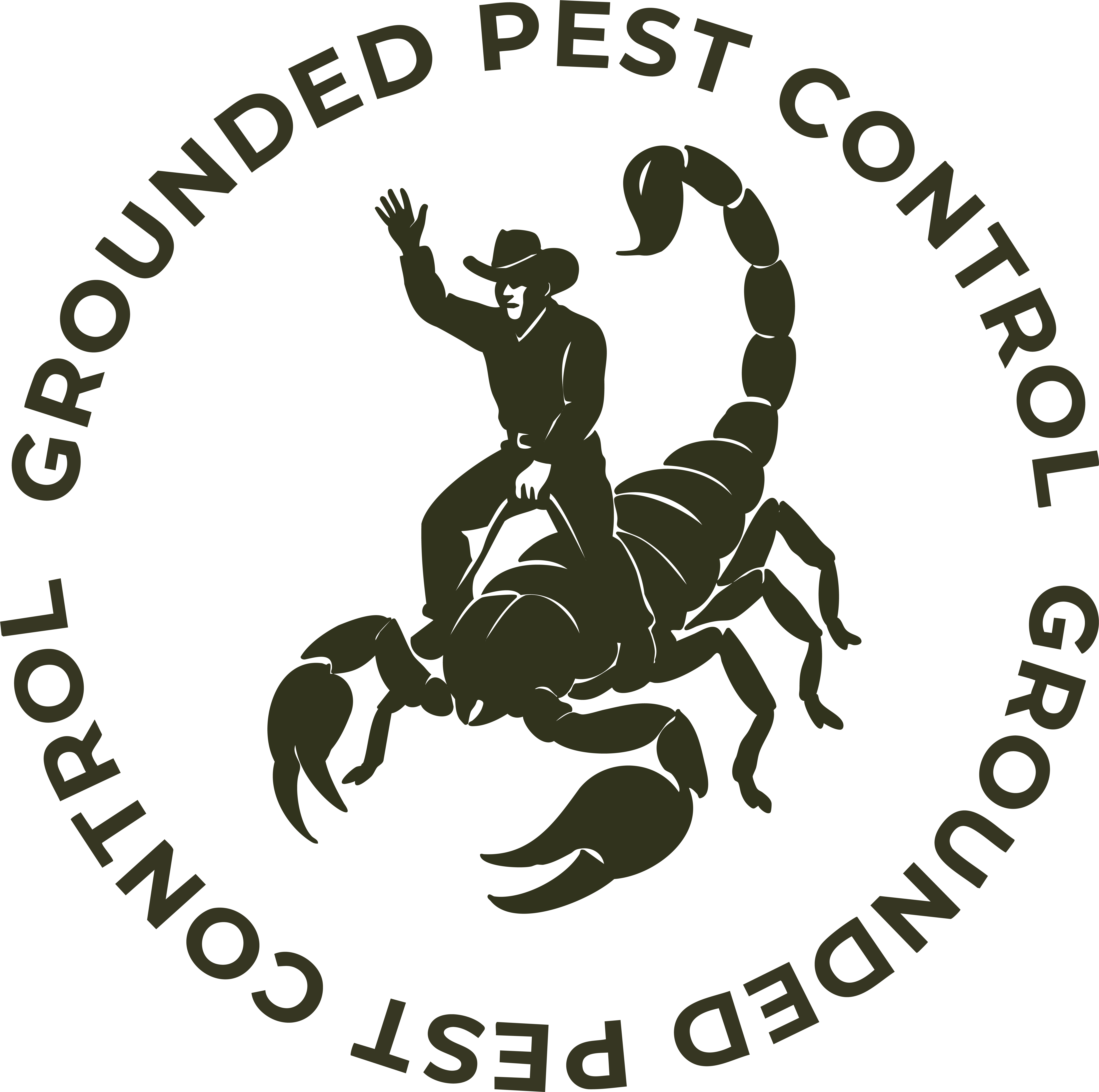 Badge · Forest


%20--%3e%3cdefs%3e%3cstyle%3e%20.st0%20{%20fill:%20%23e9e2da;%20}%20%3c/style%3e%3c/defs%3e%3cpath%20class='st0'%20d='M4487.98,945.77c4.35,1.33,6.52,9.01,6.13,13.52.33,683.25-2.96,1367.22,3.9,2049.93.62,61.48,5.53,140.97.04,200.33-.9,9.71-1.1,19.01-10.48,24.89-14.08,8.83-97.9,4.24-118.07.26-24.29-4.79-27.83-66.22-29.76-88.09-50.43-570.17-168.31-1240.93-484.77-1730.15-128.24-198.25-318.57-333.99-568.14-293.37-320.33,52.14-473.85,479.51-550.48,747.82-214.22,749.97-213.36,1572.99-203.58,2349.57,6.17,490.4,6.06,979.68,70.97,1466.15,45.71,342.61,150.93,887.85,447.13,1105.04,170,124.65,511.77,197.38,592.66-62.69,7.1-844.72,6.69-1690.97.19-2535.75-17.53-96.34-48.32-193.05-110.8-270.37-31-38.36-71.88-67.8-104.86-103.8-10.04-10.96-15.86-22.92,3.95-23.89l1293.4,3.95c43.95,13.05,118.5-5.8,98.88,63.06-20.39,71.59-72.97,150.51-91.35,226.94-12.33,51.3-8.4,103.66-10.04,154.63-23.01,715.14,5.23,1439.94.55,2156.4-.44,66.74,4.11,147.73,0,211.66-2.87,44.71-8.93,49.06-39.68,78.26-347.36,329.97-872.99,539.74-1354.23,526.98-576.34-15.28-1094.97-245.99-1435.22-713.56-532.24-731.4-645.21-1774.92-619.36-2655.38,25.44-866.23,265.32-1962.74,937.27-2567.26,432.2-388.84,1050.12-510.65,1605.5-333.12,165.67,52.96,372.1,182.91,533.48,66.3,14.69-10.62,68.46-68.26,73.49-68.26,13.68,0,54.13-2.8,63.27,0Z'/%3e%3cpath%20class='st0'%20d='M4725.76,953.97c7.14-2.03,49.25,7.15,62.55,7.75,376.16,16.76,767.54-18.68,1143.14-.35,268.11,13.08,600.51,126.83,704.69,395.06,114.75,295.46,45.54,812.28-145.98,1068.43-206.27,275.88-535.03,332.19-863.35,335.78l-9.33,6.43-.71,705.15c11.01,94.53,33.98,181.09,113.54,240.22,17.22,12.8,83.63,45.43,90.36,55.47,5.35,7.98-4.31,11.36-9.9,14.16l-152.16-10.32c-172.68,2.95-345.92-1.57-518.01-3.92-75.76-1.03-163.91,6.59-237.56.3-7.76-.66-30.58-2.73-33.2-10.44-5.25-15.47,35.59-60.48,44.67-76.47,21.08-37.12,29.73-74.04,37.71-115.49,7.2-750.3,7.33-1502.66-.07-2252.95-15.21-115.24-55.67-197.44-141.84-274.89-14.82-13.33-84.24-62.81-89.11-72.39-2.93-5.76-.79-10.02,4.57-11.54ZM5616.92,1167.31v1379.72c0,8.69,37.22,6.11,44.99,5.4,337.98-30.9,428.89-281.32,445.53-581.4,20.04-361.56,11.58-789.65-452.91-805.71-8.22-.28-33.73-10.32-37.61,1.99Z'/%3e%3cpath%20class='st0'%20d='M6264.26,3976.55c11.79-3.4,43.94-4.19,49.65,7.96,7.87,16.73,1.77,86.51,2.75,110.95,3.48,87.34,8.97,175.23,12.19,262.29-13.91,196.88,17.94,417.75.02,611.81-.95,10.3-.71,18.75-10.83,24.54-12.01,6.88-70.83,7.5-82.48.96-23.07-12.96-18.19-51.64-22.01-72.26-32.47-175.49-112.74-595.33-268.77-697.82-265.69-174.53-351.92,317.49-371.33,477.89-37.71,311.48-34.26,678.33-11.93,991.68,13.53,189.84,31.12,461.89,162.28,611.31,116.82,133.08,275.83,43.15,363.6-70.52,86.54-112.08,108.2-247.55,126.57-384.09,5.24-38.93,3.46-85.32,12.74-124.56,7.52-31.84,54.36-28.81,80.42-26.49,27.11,2.42,27.06,12,29.4,37.49,11.78,128.14-1.32,386.8-53.31,503.61-162.22,364.52-672.02,436.46-962.93,182.31-345.05-301.44-365.74-887.02-335.89-1309.06,22.33-315.79,77.82-595.27,276.71-850.65,88.75-113.96,186.57-209.93,331.94-247.15,169.5-43.4,335.1,14.14,499.89,37.83,36.56,5.26,79.48,17.36,113.32-6.18,21.05-14.64,43.11-67.57,58-71.86Z'/%3e%3c/svg%3e)
"We didn't want to build just another pest company.
We wanted to build something people could trust."
— Grounded Pest Control
In The Wild
Built to
earn trust.
Grounded was designed to live beyond the logo.
From uniforms and truck wraps to social content and customer experience, every touchpoint reinforces the same feeling: dependable, professional, approachable, and rooted in purpose.

It's branding built to last.
Built on trust. Rooted in purpose. A brand designed to protect what matters — and to earn the right to be there.